Advocacy
Dojo (HowTo)
Reference
Markets
Museum
News
Other
![]()
Myths
Press
General
Hack
Hardware
Interface
Software
Standards
People
Forensics
Web
CodeNames
Easter Eggs
History
Innovation
Sightings
Opinion
Martial Arts
ITIL
Thought

![]()
|
I've been using WindowsNT too much lately... and while I find Windows a usable environment, I also have regularly used DOS, CP/M, VMS, AOS/VS, UNIX and other command lines -- all testaments to mans ability to adapt to computers (and not the other way around). Humans can get used to a lot, and make tools out of rocks, bones and sticks -- but that doesn't mean they always use the best tool for the job. With Windows there are all these little glitches that people aren't aware of, or people just adapt to without thinking about. I think those glitches exemplify that while Windows is a tool, and is slighly better than quill and ink, it isn't always the best tool. Maybe the users just aren't aware that there are systems that do things better -- maybe they just don't care -- but I focus on interface (good and bad) and I care. I also wish more people cared. So I figure that education is the first step towards addressing the issues.
With that introduction in mind, today's rant will be on file copying.
Of course there is more to this than just copying files from one place to another -- and there are other operations that do the same things (like network copies, duplicating files, and more). However, comparing how files get copied on a Mac and Windows is an example of larger differences between the two systems in how they were created, and how each is designed.
Preflighting
When you copy a file on the Mac, the Operating System first goes out an "preflights" the destination (and source) information. The OS makes sure that the source information is all OK, and that the destination is ready to accept the copy, and that there is enough space on the destination disk to actually complete the copy, and so on, all before it starts the copy. This validation is a way to make the computer (the tool) help the user, and avoid problems (in the future) and save the user time.
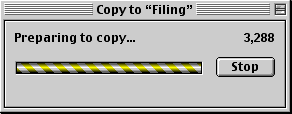
Since preflighting is an operation that can take some time, the user is given visual feedback as to what is going on (preflighting shows a "Preparing to copy" window, while the computer is checking everything out).
If the OS finds out (by preflighting) that there is not enough space on the destination to complete the copy, the computer warns the user ahead of time with a "Not enough space" dialog:
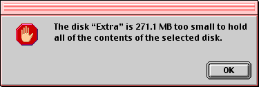
This way the user avoids wasting lots of time doing a file copy that can not succeed. Only if everything can be preflighted and looks acceptable will the computer actually start the potentially long and complicated process of doing a copy.
Why do I mention it (and stress this so much)? Windows doesn't preflight. Instead of the Operating System helping the user, and figuring out problems before hand, it waits until something fails -- then tells you (after the fact) that it has failed. Then it expects you to correct the problem for it (even if the OS should have known about, and avoided, the problem to begin with). Instead of doing things right, the OS just throws up a failure message (drive is full dialog):
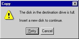
Even the error message itself is confusing since the "Insert a new disk to continue" message and the buttons "Retry" or "Cancel" seem to have no relationship to each other. Buttons reading "Continue" and "Abort" would make a lot more sense, or at least they could use a message that says, "press 'Retry' to continue".
Notice that Windows also doesn't tell you where it got the error -- if you are doing multiple copies at the same time, which copy failed? Apple's error (above) at least tries to tell you where the copy failed, which drive, the size of the copy and why. Instead, Microsoft's ambiguity creates problems and user confusion. This is an example of a bad dialog (unclear) and not caring (or knowing) about good user interface.
This whole concept of not preflighting is about as logical as an airplane taking off without checking to see if it has enough fuel to make it to the destination. Gauges were made to be read -- and the system is supposed to do simple things like "check the gauges" and see if it can complete the copy before it starts. By not preflighting it saved Microsoft programmers a little extra time and effort (they didn't have to "check" something first) -- but it costs the user instead.
This reflects the whole philosophy of Microsoft and Windows. Microsoft saved themselves some work, by pushing the responsibility on to the user. When it fails, it only wastes users time -- remember, the failure means that now the user not only has to do your copy again (after you've satisfied some conditions for the computer) AND you may have to "un-copy" (remove what it has done so far), first. Even when you do the copy next time, the OS still won't tell you if it will work or not until after it succeeds or fails. Since Microsoft doesn't have to preflight, their file copies can potentially take less time to run -- in marketing and benchmarking it makes it seem like their system is faster -- but in reality, using the Mac will be faster since it will save users costly, "re-do's" and time-wasting mistakes. This is only one of many Microsoft illusions that make them seem like they are faster (and are marketing ploys) but really cost the user in productivity.
In the interest of fairness, there is one small advantage to the Windows way. When you run out of space, you can quickly take that floppy to another machine, move the contents out, empty it, and bring it back and press "retry" and it will continue. Or you can sometimes stuff another disk in, and press retry to continue. You may even go back and delete things off the disk to make more space, and press retry to continue. None of this is really clear -- and most users don't know of it -- so it hasn't added much value. I also don't believe it can break up a really large file (that needs to span more than one disk) -- so it has limitations that make it less than great -- but in 1% of the cases, it can be better if you are a power user and know before hand how things will behave. It is bad human interface, but a rarely useful feature -- another metaphor for Windows.
Failures
What if you do a copy and a file or folder you are copying already exists in the destination?
The Mac is clean and easy, with a clear message, "Do you want to replace it".
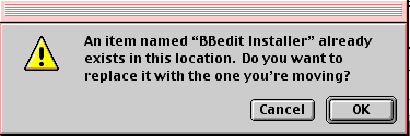
Compare that to the Windows version of the same message:

Talk about confusing, "Yes", "Yes to All", "No" and "Cancel". Why not throw in, "reverse time and downgrade to DOS 1.1" as one of the options? Microsoft couldn't create a clear and concise dialog if their lives depended on it -- the geeks care too much about features to care about usability.
Now the truth is that there are some tradeoffs. Windows offers you some features there that the Mac does not. Let's say that 98% of the time you either want to replace all the file(s) or not -- the Macs choice is far clearer, easier to use most of the time. The Mac user can either replace all the files ("OK), or they are forced to stop the copy and clean up the destination before they do the copy ("Cancel"). Probably less than 2% of the time you want to selectively replace some of the files -- "Yes" (replace this one and keep asking and don't replace all the files) and "No" (don't replace this one, but keep asking and don't cancel the copy). Windows has that ability -- the Mac doesn't.
Microsoft's way works, and it has a little more versatility -- but it decreases productivity, increases the likelihood of errors, it decreases the safety, and increases the confusion. Probably 99% of the time the Mac way is far better and saves time -- but because of that 1% worst case scenario (that most users will never care about), the Windows people think that their "power" interface is better than Apple's clearer interface.
This demonstrates that Apple is better -- but not perfect. Apple opts for clean and simple -- Microsoft opts for complex and confusing (and usually incomplete).
True power
The duplicate file example seems to indicate that the Mac is easier and clearer most of the time -- and Windows has usually useless features that sometimes come in handy if you are a power user. The sad truth is that Windows isn't usually more powerful -- just more confusing. Microsoft often throws in quick hacks and features (like in the previous copy dialog) in order to avoid making a decision about the way something should normally behave, then they miss obvious and key "features" that truly make the computer more powerful (and valuable).
Take a far more common scenario than that previous "Power Feature" that almost no one really uses. Let's say that you were doing a copy to a drive that would have enough space if you just emptied the trash -- but since you haven't done that yet, there isn't enough room. Windows just gives you the same old, "not enough space" message. The Mac preflights and figures out that you could copy the data, "if" you just emptied the trash first. So the Mac asks you clearly if you want to empty the trash to continue:
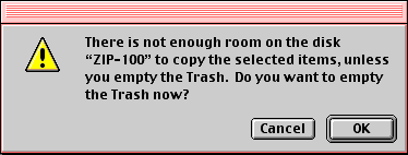
Again this reflects the philosophy of the Mac and Windows. Apple believes in making it easier for the user when they can. This is a common behavior that people are going to want to do. Apple thought about it, and added it. Microsoft doesn't think ahead or really care about the user -- they care about marketing. So Microsoft believes in doing the minimum necessary to market the product and sell more product -- and they add features to avoid making a decision that might offend some geek somewhere, even if it would make the product more useful 99% of the time. Then they ignore features that would take time and they would have to think about -- because no one will even think about these issues until AFTER they've owned the product for a while (and it is too late to change their mind).
Status
Let us assume that everything in a file copy is going OK. On the Mac it has preflighted things and it is going to work out -- on Windows we are keeping our fingers crossed, but it will probably work out. Still, File copies can be long operations (sometimes taking many minutes). Since the copy will take so much time, it would be nice for the computer to popup some status and tell us how things are going. So the Mac shows a nice clean window to explain the progress of the copy -- it contains information about how far along the process is (in files count, and size) and offers an estimate of how long (in time) the operation is going to take to complete:
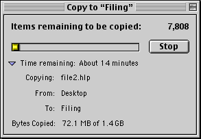
Normaly the dialog just shows the number of files left and approximate time left to complete (what users care about). But there is a little rocker arrow, which allows power users to see more about the copy including source:destination and size of the copy. This rocker is called progressive disclosure -- don't show people more than they need/want (and don't waste space) unless they ask for more. All this seems logical and obvious. It is the way things should be done.
Now let's compare that to Windows:
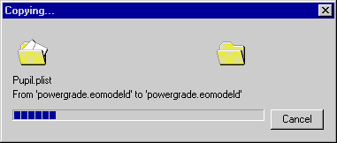
Windows has a progress bar -- but the progress only shows the progress of each file copy -- not the progress of the total. This makes it completely useless - I don't care if it is half done with one file (out of 10 or 100 files), I care about how near to completion the whole operation is.
Windows has a graphic little piece of paper that flies from the source folder (assuming you know that the folder to the left is the "source"), to the destination folder, then disappears. Assuming you know that this means that the destination isn't eating your folder, it is supposed to reflect something of value -- though I'm not sure what. To me it just looks like a sizzle feature -- one that looks good but does nothing but waste processor time and waste screen real estate doing nothing of value. Remember, good interface is about providing valuable feedback -- not just cute animations.
Notice again how both are labeled (the text) -- the Mac tells you it is copying a file, from one place to another (name, source and destination); Windows tells you that the source name and destination name are going to be same. Well, Duh! Like we didn't know that. Copying never changes the file name, so this duplicate naming is a waste of space and confusing since users are left to wonder why it is there. Yet where is it coming from? Where is the copy going to? Useful information is eliminaed in favor of useless.
Also notice the name of the buttons. Windows says "Cancel" the Mac says "Stop". You can't cancel a copy. The files copied are already copied -- "canceling" will not go out and remove all the files that are already copied. Really, the only thing the "Cancel" can do is "Stop" copying more files (or stop the operation where it is). Mac is labeled properly, Windows label is misleading.
I know these are little issues -- but they are the little issues that define a good interface from a bad one. These are the operations that you will use day to day, and that will mean the difference between a user understanding what is going on, or scratching their head and having to dive into a "For Dummies" manual to figure out what is really going on! They aren't the dummies -- Microsoft designers are.
Remember, every time you are confused about what is going on with a PC (or Mac) that it is not just "you" -- there is a good chance that the interface is not being clear and letting you know what is happening. Sadly, there is a psychological barrier with people (using computers and other tools) where the people just blame themselves instead of the interface designers. This is sad, because if people were smarter about placing blame where it belonged, then Microsoft would get the credit they deserve, and maybe then things would progress faster and interfaces would get better.
The Mac is not perfect -- just better
The Mac is far from perfect.
There was one flaw that I was going to document that existed in System 8 with file copying. Basically, the problem was that Apple allowed multiple copies to be happening at once -- either coming from one machine, or by allowing remote users to copy (via file sharing). This meant that preflighting alone was not good enough. The OS could preflight how much room was left on a disk, and you could either start another copy (that would take more space) or someone else could be copying to your disk remotely, and still fill up the space that the system thought it was going to have. In which case the copy would fail (gracefully), and tell you that it ran out of room (just like Windows normally does). But it shouldn't have to do that -- it should only start copies that it can complete, and not allow others to start copies that are going to prevent both from completing properly. It was a rare occurance -- but something that should have been avoided.
This demonstrates that Apple was not perfect -- just better. Preflighting was better than not preflighting, and the Mac way is better than the Windows way -- but there were better ways still. What Apple also needed to add is some routines that would do "reservations". The better solution would be if the copy (preflight) would "reserve" the space that it was going to need to complete the copy. Then, by reserving that space in advance, it would preventing anyone else from filling that space up once the copy was already started -- or to allow them to start copies that couldn't be complete (since my original copy was taking more space as time went on). So I was all ready to explain this -- when Apple beat me to the punch! I tried the test again (under 8.6) and the problem had been fixed. <sigh> I don't know how long it has been fixed, but it is nice to know that Apple fixed it before most users even became aware of the issue (and it wasn't much of an issue to begin with). I can't even fathom that kind of response from Microsoft -- usually they are blaming the user for not using the system correctly, while simultaneously promising a fix in Windows1900 (due some time around 2010).
Tiling Windows
There are still a couple of other areas / issues that I can think of like that last issue as well. When you start multiple copies on the Mac, it opens a window for each copy:
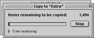
Now on the Mac each Window (copy) is opened up slightly staggered, so that you can see there are other copies going on, and there is some visual feedback that something has changed. On WindowsNT the copy status windows are opened directly on top of each other so that you can't tell that anything has changed -- unless you read the actual files that are being copied, or if you go to move one of the windows, and find out there is another one behind it (which can be a surprise). Again, it is the little things like this that increase the confusion (and errors) when using Windows.
Yet, the Mac way is not perfect -- just better. There is another issue that only a geek could know and love. Basically, some file copies should not be done at the same time (they should be serialized). If you are copying from the same source, or to the same destination, or both, then you should really do those things one after the other (seially) instead at the same time (parallel). But if you are copying from different sources and to different destinations then you should definitely do them at the same time (since this speeds up the operation by doing many things at once). The Mac (and Windows) just always do them in parallel.
The reason why you should serialize some copies is that disks have to seek (move a little arm) to find the data and read or write it. By doing copies at the same time, the disk has to do a little of one file (swing to one area of the disk) then a little of another file (swing to a different area) -- this slows down the copy and stresses the drive (a bit) since it has to seek all over the place. It also has a mild issue on writing the files (from two sources) since it will write part of one file, then part of another file, then back to the first, and so on. This creates fragmentation that slows future disk performance down.
What this means is that the better "copy" interface would be a more complex window that shows the schedule of all the copies that are being done, in what order, and how long for the whole thing (as well as little times for each separate copy). It would probably have one window, that would get other copies added to it (as a sequence of copies). It would have multiple stacks of copies, with an order (that users could change by dragging) -- with each stack being grinded on at once. Users may not necessarily understand why things would stack the way they do (performance) but they would understand that copies had a sequence and multiple ones would be happening at the same time (when it made sense to the computer) -- though I think if you showed source and destination disk groups as why copies were grouped, the users might understand how they are grouped (even if they weren't quite sure why). It would take work to display this interface clearly and intuitively, but it could be done. So I don't think the Mac is the best solution possible -- just the best one I've seen so far. Yet again, I hear that Apple is hard at work on changing some of the interface for OS X, including more a "global" status and progress for some things -- and this might even include grouping the status of file copies.
More
On the Mac do a file copy to a floppy disk, and try to eject -- the Mac has a software controlled eject so that you can't interrupt the copy midstream and destroy data in the process. It won't eject the disk until the copy is complete. PCs have an eject button, so that if users aren't paying attention they can eject mid-write which can corrupt their data and sometimes all the data on the disk. Of course that throws up an error that may make no sense to the user.
Imagine you are doing a copy that takes a couple minutes -- you forget it is in-progress, and so you eject and stuff another disk in (to read in some file you want to work on). Then you notice that some dialog is complaining that your copy failed. What copy? You're just trying to read a disk. Since this "retry" button (and dialog) looks similar to the "having problems readng the floppy" dialog, "would you like to retry" -- many will just press "retry" thinking it will attempt the read again. That means that their floppy will get filled with crap you don't want on it (the rest of the previous copy), or it will have another error (filled disk, wrong disk, etc.) that makes even less sense. Again, all this ambiguity is caused by bad interface -- or at least the Mac has a better interface.
Little things like that are littered all over the place -- but you often have to be an interface person (or engineer) to explain them. Users realize them by scratching their heads, or being confused. There are dozens of other things like these that I haven't stressed. The issues mentioned are just the issues that I have come across, there are many that I don't know of (it is hard to know it all).
Conclusion
Average people (not interface or computer people) make the assumption that the Mac and Windows are the same -- unless they've used them both. Ignorance by PC users make them think the Macs have the same problems as Windows -- it usually doesn't. Ignorance by Mac users often leads them to assume that Windows is as good as a Mac or it behaves like the Mac -- it often is not. If people are experienced with both, they know the Mac is better and they often become Mac advocates. But most users are not interface people and they are not trained to explain why the Mac is better. They just say ambiguous things like "the Mac has a better UI" -- to which many Windows people (who know even less about interface) respond, "it is just a matter of preference". Some issues are about preferences -- most are not.
There are absolutes or very strong rules for a good a clear interface. Decades of working with Macintosh and Windows has led me to the conclusion that either Microsoft is full of incompetant buffoons that don't understand the basic concepts of User Interface (at all) -- or else Microsoft as a company just doesn't care about good interface and won't invest the time/money to do things right (which costs users big money later on down the road). Everywhere I look there is more and more that makes the Mac better -- and all these "better" things save me time and increase my productivity. And all these issues and quirky behaviors are focused around something "simple" like just doing file copies. Imagine the more complex operations and how much Apple's better attention to detail matters.
Some people will argue that these issues are just little nitpicky things that usually don't matter, or only matter when someone is first learning the system. In some ways I agree -- they do matter more when you are just learning the system. But the point is that interface is about all the little details and clarity and about picking nits. It is all these little issues that add up into big issues. Wasting 10 minutes here on a mistake, and 20 minutes there looking something up, or reading a "for dummies" manual, all add up. I can use Windows. It works. It is a usable but primitive tool that has a lousy interface. Windows it is not a cost-effective use of my time (compared to a Mac) -- this would be true for many people, if they knew only better. Hopefully, a few dozen more articles like this will get the truth out there, and people will start to get the idea. Remember, the Devil's in the details -- and he lives in Redmond.
Read the follow-on to this article "More Copying" for even more information on this simple issue.
|