![]()
Advocacy
Dojo (HowTo)
Reference
Markets
Museum
News
Other
![]()
Myths
Press![]()
General
Hack
Hardware
Interface
Software![]()
Standards
People
Forensics![]()
Web![]()
CodeNames
Easter Eggs
History
Innovation
Sightings![]()
Opinion![]()
Martial Arts
ITIL
Thought![]()

![]()
![]()
![]()
|
When Apple CEO Steve Jobs unveiled the Aqua interface for Mac OS X at his Macworld/San Francisco keynote, he put forward the most dramatic user interface change for the Mac since the original Mac was introduced. Understandably, this sparked a lot of discussion in the Mac community (the interface lists filled up like the sewers at superbowl half-time).
Steve Jobs started by saying his announcement by saying that it was interface that made you want to lick it. Since slobber on the monitor doesn't improve the usability, I'll pass. But the interface does remind me of what would happen if you left a jolly rancher candy on the Mac interface on a hot summer day -- so I refer to it the jolly rancher interface, but I've also heard gumdrop, and gel-caps as other analogies.
Interface people are paid to notice all the little details, and make sure that everything makes sense and is conveying the most information possible, in the clearest and easiest to understand ways -- basically we are like editors, under-appreciated nitpickers. Let's go through the new interface changes, and try to pick some nits and see what we can learn.
What it looks like
|
There is a nice use of transparency so not only do controls look sort of translucent, but menus see thru to the background, and things cast shadows to soften transitions. Even dialogs are translucent and cast a shadow. It is a nice visual effect and is appealing to my eye. |
 All
the controls have this translucent fruity color
effect -- which is appealing to the eye. The 3D
effect of controls is very pleasant -- and
everything looks like these bubbles of fruity
flavors.
All
the controls have this translucent fruity color
effect -- which is appealing to the eye. The 3D
effect of controls is very pleasant -- and
everything looks like these bubbles of fruity
flavors.Icons
|
Large icons are of course are screen space wasters -- and because of their huge size, they make some people feel like the interface is cartoon-like (or so I've heard). But they are visually appealing, and you don't have to use them this large. So I have nothing against allowing large icons for beginners or previews, and using large for demos -- as long as it doesn't mean that this will be the normal size while working (which I highly doubt). So this addition does some good and no real harm -- so I'm for it. I'm an icon fiend, demanding a nice visual language and many rules for what icons mean and how they should look. The Mac had a whole language for icons and what they meant, NeXT had a little less, and both languages got diluted over time (and lost something in the process). I'm hoping that Apple at least defines as much as they did before, if not more, and strongly encourages good usage. There isn't enough queues (from what I've seen so far) to know what the visual rules are for icons in Aqua -- but Apple hasn't released the new interface guidelines (yet). When they do, it will help programmers (and users) understand more about icons and aqua, and how to use its new visual language. |
 Icons
in Aqua can be huge, highly detailed, and use rich
accurate color (32 bit / millions of colors) -- and
they can scale from the largest 128 x 128 pixel
size, all the way down to mini-icons.
Icons
in Aqua can be huge, highly detailed, and use rich
accurate color (32 bit / millions of colors) -- and
they can scale from the largest 128 x 128 pixel
size, all the way down to mini-icons.Menus
|
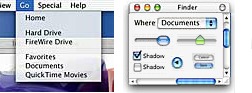
Menus are one of the most important parts of a GUI (Graphical User Interface) because they are used so often. Menus are the interface element that broke the old models of command lines, secret commands (that you had to memorize) and modes. Menus gave us a more modeless interface, with more commands available at a given time, and the commands arranged logically and in a way that users could see and explore. This alone was a huge leap forward in interface -- so I think menus are very important. Of the menuing systems, there are a few different ways to work. The Apple menubar is far superior to the Windows (and often UNIX) way of doing menus, for many reasons I've gone into in other articles (http://mackido.com/Interface/menus.html). NeXT menus are a close runner up in behavior to Apple's, with even a few advantages -- but they used a bit more screen real estate, and they certainly weren't better enough to justify using their different behavior on the Mac -- so I think Apple made the right decision to keep the Mac menubar (over the NeXT way). Either way, the global menus (Mac and NeXT) are far superior to many local menus (Windows and UNIX).
Some interface people don't like the translucence effect -- it detracts from clarity of the text. I agree that it can, but I don't find it significant on he demos -- and I believe that there can be a balance that makes it look good, and yet still doesn't detract from the readability. So even if it did turn out to be too strong now, it could be made more subtle by release. Other interface people are concerned about anti-aliased text -- both in the menus and throughout the system. (Anti-aliasing is an effect that smooths but blurs the text in a way to use colors to simulate higher resolution). With large and medium size fonts the effect is usually very nice -- but at low resolution/sized fonts, the effect can make the text less readable. Aqua seems to fix this problem by making the text larger everywhere. This makes for a nicer look and readability/clarity -- but it also means less screen real-estate efficiency. So there are some questions about those tradeoffs, and who is going to have control over things (users with preferences, or Apple). I'm not overly concerned because this stuff is easy to work out and change. There appears to be some rearrangement of where things will be on menus using Aqua. These things quickly can devolve into religious wars -- but what I care about as an interface designer and as a user, is that there are clear rules for where things will be -- sort of a syntax for menu design in the Aqua interface guidelines. We don't have the guidelines yet, so I can't comment too much on the new arrangements -- but I can tell that some things will change (especially with the Apple and Application menus). Time will tell, and people hate change, so there will be some whining -- but if things are more consistant, and logical, then we'll just have to get used to it. There is a lot that is not yet known about the menus (but should be known shortly). There were power features in NeXT, like tear-off menus. I don't know if Aqua will have them are not. But I personally think all this stuff will get worked out just fine. There are arguments for and against tear off menus -- the negatives are mainly that tear-off menus are an interface element that is abused and encourages people to use a poor, screen real-estate wasting behavior and gives some designers an excuse for not doing things better (like creating specialized palettes), but there are many positives as well like a more visual operating mode, more user control, and so on. Personally I'm hoping that they will have tear-off menus, and think it is quite likely, but we'll have to wait and see. |
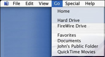 The
look of the menus is only relatively unimportant to
me (assuming they are clear, asthetically pleasing,
and readable) -- and users adapt to subtle changes
in looks very quickly. The new menus do look a
little different with sexy features like being
lined, with a slightly translucent effect and they
also cast a shaddow to give a nice 3D effect. And
the menus also look a lot like a nice evolution of
the Mac menus.
The
look of the menus is only relatively unimportant to
me (assuming they are clear, asthetically pleasing,
and readable) -- and users adapt to subtle changes
in looks very quickly. The new menus do look a
little different with sexy features like being
lined, with a slightly translucent effect and they
also cast a shaddow to give a nice 3D effect. And
the menus also look a lot like a nice evolution of
the Mac menus.Special Effects
|
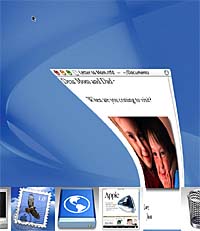
It looks like Apple is trying to keep these subtle behaviors, but update and improve them. The genie effect (as it is called) graphically displays what is going on -- the window get smooshed down to an icon to fit into the dock -- and the icons get stretched back out to become a window. While few would call this subtle, it clearly conveys to the user what is going on. This is a great transition. My only complaint is that I'm hoping it will be a bit faster than the demos show -- I prefer transitions to take less than about 1/4th of a second or less, more than that and the animation slows the user and operation down (and gets tiresome after the first few thousand times you watch it). Of course processing power can improve this over time if it doesn't start out right -- and having a clear transition like this is much better than not having transitions (like in Windows). As I said, I really like the clarity of the behavior -- even if the effect seems a little cartoony and gratuitous. Another nice effect is the magnification effect. Icons in the dock can be small -- but the ones that are being looked at (with the mouse) grow and are magnified to see their detail. This increases screen real-estate efficiency by making most things smaller -- while still giving users the advantage of detail by making the object of focus use more space (so that they can clearly see what it is and all the information that should convey). This is a good balance between maximizing size, and maximizing information. The magnification effect is borrowed (from Sun I think) -- I remember the effect, but am not 100% sure who demonstrated it. Years ago I remember seeing a prototype 3D interface that used a similar magnification effect to try do a similar thing. The whole display used small icons/images, but as you focused on them they were magnified into detail -- so you moved what you were focused on around the screen like a giant magnifying glass. The annoying part of the effect is that it worked on the whole screen, all the time. The dock magnification effict is a similar but more focused (only one dimensional) -- making it far more useful, and far less annoying than this happening over the whole screen. Frankly, the other way would make you nauseous and disoriented after using it for a while. So I'm glad to see that Apple is thinking, and willing to steal (and improve). However, there are a lot of subtle transitions in the Mac -- and all of them have to be updated to have the new feel and be consistent. It isn't hard to add a neat feature or idea -- it is far harder to use that idea everywhere that it makes sense, and keep things consistent. But that is what good interface is all about. The demos of Aqua still have some bugs and misses in detail -- but it is still very early in the development process and there is still time to get it all right. If all these details are improved, and it looks like they will be, then Aqua really will be an improvement. |
 The
Mac has zoom rects (animated rectanges) which show
many window state changes (transitions). When you
double click an icon the little animation shows
what is happening because the icon opens/grows into
a window through the use of rectangular outlines.
These transitions are part of the interface
subtleties that make the Mac the best GUI available
(to date). In fact, it is the hundreds of little
subtle things like this that makes Windows suck
(compared to the Mac). On the Mac when an
application or folder is open, the icon reflects
this (by being greyed out), of course Windows does
not. These details and polish are very important
(yet subtle) information cues to the user -- and it
is these details that make an interface good, or
just an amaturish hack.
The
Mac has zoom rects (animated rectanges) which show
many window state changes (transitions). When you
double click an icon the little animation shows
what is happening because the icon opens/grows into
a window through the use of rectangular outlines.
These transitions are part of the interface
subtleties that make the Mac the best GUI available
(to date). In fact, it is the hundreds of little
subtle things like this that makes Windows suck
(compared to the Mac). On the Mac when an
application or folder is open, the icon reflects
this (by being greyed out), of course Windows does
not. These details and polish are very important
(yet subtle) information cues to the user -- and it
is these details that make an interface good, or
just an amaturish hack.Dialogs (sheets)
|
Sheets are a very nice improvement to the interface, and are long overdue. So Aqua gives us another interface win. |
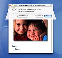 There
aren't "dialog" windows anymore, there are
"sheets". Sheets are dialogs, but they are bound to
winodws and are tied in to windows by function, by
text (what they say), by proximity (being located
just under the window titlebar), by look (they are
translucent and look attatched), and by animation
(they come out of the window). The genie also works
beatifully with the way that sheets (dialogs) come
out -- it shows relevant transition. This is all
really good interface.
There
aren't "dialog" windows anymore, there are
"sheets". Sheets are dialogs, but they are bound to
winodws and are tied in to windows by function, by
text (what they say), by proximity (being located
just under the window titlebar), by look (they are
translucent and look attatched), and by animation
(they come out of the window). The genie also works
beatifully with the way that sheets (dialogs) come
out -- it shows relevant transition. This is all
really good interface.Buttons
|
I like animation, to a point, but it can quickly go from catching your attention to pestering you like the 4 year old child saying, "mommy, mommy, mommy, mommy..." about three thousand times. If the effect is subtle, it isn't bad -- but in the demos of Aqua it was not yet subtle enough. I reserve a special hatred for functions that pester me into submission and that don't know when to get out of you way -- like I despise the annoying little "agent/helper" in Microsoft office for just this reason. This means that to me, the Aqua buttons may be a step sideways (or backwards). But, I, and the other interface weenies complaining about this, may be jumping the gun. I should really reserve comment until I use it for a while to make sure it is as annoying as it seems (at first glance) -- it may not cross the annoyance threshold and be just fine. |
Concerns
So far, many of the Mac faithful have given Aqua positive reviews, generally outweighing the negative voices. In fact, most people seemed to like what they saw. But there are also concerns of those who see problems that could arise from the changes Aqua will put us all through. So keep these negatives (concerns) in perspective with all the positive feedback, while looking over these potential issues and areas for improvement. Each group of users seem to have unique concerns.
What I've heard so far includes:
- Developers - Some developers were put
off by Aqua -- they felt the Mac interface was being
glitzed up at Jobs' orders. They fear that form may take
precedence over functionality, much as it did with
Apple's current round mice, dinky little keyboards and
the interface changes for Sherlock and QuickTime.
Lately, some developers feel they've had decisions shoved down their throats by Jobs (or his management) without a chance for input. Compounding this problem is that Apple under Jobs is "closed," refusing to talk to developers about the company's plans -- it's hard to quell developer trepidations with deafening silence. However, developers are scheduled to get the test versions of the OS with Aqua at the end of January, and that should at least help to address the lack of communication.
I don't think many are giving Apple quite enough credit -- despite the glitzy look and feel of Aqua, the interface does seem to make a lot of sense (at least from what we've seen so far), even if it is a rough "work in progress." Given time, and constructive feedback, Aqua can grow into something as nice and polished as the current Mac interface. Who knows, Apple might even address their other concerns as well (sooner or later).
- Professionals - Some professionals -- both
artists and business types -- were very concerned with
Aqua's candy-coated interface. They didn't feel it was
professional enough for their desktops and didn't want
another battle with the ignorant elite (PC advocates,
IS/IT and the PC press). However, users will get used to
the new interface, whether they like it or not
(especially since Ken Bereskin, Apple's Director of OS
Technologies, Worldwide Product Marketing,has
said that Mac OS X will not support switchable
themes). However, as long as the interface works well,
and if it saves time and enhances productivity, then they
can (and will) suffer slings and arrows about the
lickable looks.
- Home users - A few home users and artists that
I talked to were concerned over the loss of themes and
customization. Many people love to personalize their
computers and they've loved that on their Macs for 15
years. They wish Apple would help them instead of
fighting them. The geekier in this crowd know that Apple
has intentionally covered up the theming capabilities of
the Mac OS -- and they resent it. They want to be able to
make things their own and they feel that Apple wants to
make their choices for them. While many of them really
like the new interface, it is still a personal
preference, and one flavor does not fit all people.
I think we should all agree that themes and customizability are a secondary (or even tertiary) concern behind getting a good interface and a solid OS out in the first place. After OS X comes out and is shown to work, then we can see whether Apple will allow some sort of customization -- and then it will be the right time to put pressure on them to do so. But first things first. So even though these customizability concerns are valid in the long term, for now they should be a low priority.
Conclusion
Overall, I think Aqua adds many nice improvements to the Mac OS, and includes few decisions that give me concern. I'll voice the concerns, but I believe that Apple will address many of them (whether I voiced them or not). Even if Apple doesn't, there is nothing so bad in Aqua as to render it unusable. After all, people put up with Windows or various UNIX interfaces, and so far Aqua looks far superior to those. The new Apple loves "the big surprise." I don't think we've seen everything there is to Aqua -- I think it is meant to show a direction in which things are headed. This is communication (a good thing), and it is progress. Of course many people have concerns -- Mac people are interface perfectionists (and I'm proud of the lot of them) -- but I want to give Apple a chance to change, as long as they don't lose site of what is important.
I'm pretty happy with Aqua so far, in that it's doing exactly what it should do (for now) -- it is trying to do things better. By mining the NeXT interface for the most valuable parts, grafting them to the successful Mac interface and adding new behaviors, Apple is aiming to make something more modern, something that is able to grow in the future. It even borrows a little from Windows as well -- and that shows that the NIH (not-invented here) age is completely over at Apple. As long as they still consider older reliable Mac behaviors, then things should come out all right.
There are more unknowns than knowns, and there will be for a while -- but compared to previous versions of OS X Server, we are seeing progress and a direction, mostly in the right direction, even if Aqua still has a ways to go. These features should give you an idea of what Apple is trying to do. Aqua interface is more visual, seems to have a translucent and jelly-like theme. There will more use of animation and larger icons, and active elements (like rollover buttons) and active controls. So, all in all, there are a lot of subtle changes to the interface -- and far more of them seem good than bad. I'm looking forward to getting the developer demos, and getting to work more with the interface so that I can make more informed opinions -- it seems silly to get too worked up, yet, because not everything is in stone and I haven't had weeks to use it (and get over my initial bias). If Apple keeps going in the current direction (and listens to some feedback), then by the time Aqua is released, it should be a very nice user interface -- even though at this point it is still a little immature and a "work in progress".
|