![]()
Advocacy
Dojo (HowTo)
Reference
Markets
Museum
News
Other
![]()
Myths
Press![]()
General
Hack
Hardware
Interface
Software![]()
Standards
People
Forensics![]()
Web![]()
CodeNames
Easter Eggs
History
Innovation
Sightings![]()
Opinion![]()
Martial Arts
ITIL
Thought![]()

![]()
![]()
![]()
|
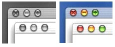
Aqua windows have slightly rounded corners (no sharp corners to scratch yourself on), they throw a neat soft shadow, and have these little fruit filled water blisters for controls. It all goes with the theme. Scrollbars are these little water bubbles -- and the controls offer immediate feedback (When you move the controls the page scrolls with you not waiting until you are complete to scroll the page. When you move a window around the actual window moves around -- not just an outline of the window). These active controls are great things -- and would have been done with the original Mac, if computers had the power back in 1984. Macs have had these behaviors with various 3rd party extensions -- but with Aqua they are all built in. So these changes are nice improvements that are long overdue.
Window Controls
|
Not having shape/detail differentiation is less clear than interface can be, and an evil thing to do to color blind people -- for color blind people what is the differentiating design / shape? There is differentiation by position -- but that alone does not make a clear interface.
Color also conveys information. Red, yellow and green are used to convey "stop", "slow down" and "go" in the visual language of traffic lights (and many other devices). In this context (windows) that color still makes sense -- red "stops" the window by closing it, yellow does slow down the window by hiding it, and green fills the work area with the window so you can work with it at full tilt. So the color choice is logical. This look/behavior really isn't better than the Mac, but it doesn't seem worse either -- just different. Some interface people are concerned about the colors and what they mean (red meaning "bad/avoid") -- but I think this stuff is minor enough that it will be fine in real world use. |
 However,
on closer examination there is differentiation by
shade, and when you roll over, there is
differentiation by detail (each shape has a
different symbol etched in it, which you see when
you mouse over the buttons). So my initial
concerns, in this area, were quickly assuaged.
However,
on closer examination there is differentiation by
shade, and when you roll over, there is
differentiation by detail (each shape has a
different symbol etched in it, which you see when
you mouse over the buttons). So my initial
concerns, in this area, were quickly assuaged.Grouping
|
Position and proximity (grouping) are important interface issues -- so when I realized the position (and proximity) of the window control had changed, I had more concerns. (It is my job to get concerned about interface changes).
Maximize and minimize were grouped (proximity) because they do related things (resize the window). Because they do opposite things, you don't want them too close together either (hence the small space between the controls) -- but they logically are related and so should be somewhat near each other. Remember, proximity (and lack of proximity) are very important when doing good user interface. |
|
Windows also has parent and child windows (child windows only exist inside of parent windows). This is an annoying interface by itself, but it was made worse by the window controls. When you maximize a child window, its controls are right next to the parents controls -- thus also guaranteeing that a miss will do something, and probably something you don't want. |
|
So you can see why good interface is important and proximity and position matter. I had concerns since Apple put the Aqua window controls (close, minimize and maximize) close together.
|
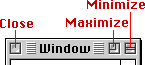 On
the Mac the close control was kept as far away from
the maximize or minimize controls as was physically
possible -- they were on opposite sides of the
window title. This positioning meant that you are
seldom going to miss when trying to close, and
accidentally maximize the window instead.
On
the Mac the close control was kept as far away from
the maximize or minimize controls as was physically
possible -- they were on opposite sides of the
window title. This positioning meant that you are
seldom going to miss when trying to close, and
accidentally maximize the window instead.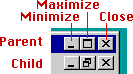 Microsoft
on the other hand did a poor job with Windows. They
placed the maximize and minimize next to each other
as well -- right next to each other. They are way
too close as any Windows user can tell you. They
also put those controls right next to the close
control. The reason interface designers care about
proximity is that people miss (when clicking on
things) -- and so they need to be concerned about
the consequences of a miss. When people go to
maximize they might close the window instead -- the
worse possible behavior since it is the exact
opposite of what they want to do. Missing maximize
(and hitting minimize) is sort of like that too,
but it doesn't require relaunching a program and so
is not as big a deal. Windows window-controls (and
Windows design in general) shows a complete lack of
understanding about interface.
Microsoft
on the other hand did a poor job with Windows. They
placed the maximize and minimize next to each other
as well -- right next to each other. They are way
too close as any Windows user can tell you. They
also put those controls right next to the close
control. The reason interface designers care about
proximity is that people miss (when clicking on
things) -- and so they need to be concerned about
the consequences of a miss. When people go to
maximize they might close the window instead -- the
worse possible behavior since it is the exact
opposite of what they want to do. Missing maximize
(and hitting minimize) is sort of like that too,
but it doesn't require relaunching a program and so
is not as big a deal. Windows window-controls (and
Windows design in general) shows a complete lack of
understanding about interface.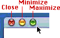 However,
Windows controls are very close together -- and the
mouse is hyperactive -- so it is very easy to miss
and hit the wrong target. On Aqua, the controls are
better spaced, and the mouse is less hyper (the
acceleration curve for the mouse was designed by
someone other than a spaz). Meaning the mouse will
fly around in a more reasonable and tame manner,
and the likelihood of missing the a control and
hitting the wrong control will be reduced.
However,
Windows controls are very close together -- and the
mouse is hyperactive -- so it is very easy to miss
and hit the wrong target. On Aqua, the controls are
better spaced, and the mouse is less hyper (the
acceleration curve for the mouse was designed by
someone other than a spaz). Meaning the mouse will
fly around in a more reasonable and tame manner,
and the likelihood of missing the a control and
hitting the wrong control will be reduced.Ordering
Proximity also implies grouping (relationships). Grouping these controls does make some sense since they are all behaviors for managing the windows visibility. So the new grouping does makes sense. But another issue is order and what happens when you miss.When you put the controls together (and grouped) then you need to know that people miss -- so which controls are next to each other is important.
On Windows, when you go to maximize and you miss, it means you will either minimize or close the whole window. This means that when you are trying to focus on your work (maximize), and you miss, then your work will go away. If you go to close the a Window, and you miss, you are likely to maximize the window -- thus filling the screen and blocking you from doing your work and what you intended. If you try to close a sub-window, in order to focus on another sub-window, and you can accidentally miss, you are most likely to close the parent window (Application) -- which will quit and close all child windows, including the one that you wanted to work on. So the proximity of controls on Windows almost always guarantees that the interface will do exactly what you don't want it to do if you miss. A brilliant example of how not to do interface.
On Aqua, when you miss closing a window, you are most likely to hit minimize. That still makes the window go away so that you can continue doing other work. This isn't as permanent as close -- but bot so bad a behavior. When you miss minimizing and hit close, the window still goes away, and you can continue doing other work -- which is still what you intended to do (just close is a little more permanent than minimize). Minimize is near the close because a miss on those two is less significant. Better logical ordering. Maximize is furthest from close because it is the further away in behavior. You can still miss, and maximize instead of minimize, or vise versa -- but those differences aren't that big a deal since you aren't closing the application or files and having to rerun everything (which takes a lot more time than just clicking a control again). Of course you can never fix all issues with proximity and the cost of a miss -- but you can minimize them -- and the controls are far better ordered on Aqua than on Windows.
Mouse based focus
Another new change (for Macs) is mouse based focus. On many UNIX interfaces, whatever window the mouse is over is the focus. This means that if you type, click controls, use menus, and so on this all gets directed at whatever window or application the mouse happens to be over, even when that is not the front most window. Apple's early interface research, and about every users I've ever seen use X-Windows, has shown that this interface is confusing to users and causes mistakes -- it is just too easy to bump the mouse while typing, or for users to misunderstand. It is just far more logical that the commands go to the window or application that is in the front (front window based focus) -- so I personally dislike (strongly) mouse based focus, for most things because the focus can change too easily.
However, there are a few limited conditions where you don't always want to bring windows or applications to the front to operate on them. As the Mac interface has progressed, Apple has evolved the Mac to allow some non-focused or mouse focused commands. For example: in the Finder, you can hold command key and move background windows without bringing them to the front. Drag and drop works by taking things from the focused window, and placing them in a non-focused window. Sometimes you can automatically changing the focus to follow the mouse (like spring loaded folders or some drag and drop). So not all mouse based focus is bad, you just have to be careful how you use it to reduce errors.
Aqua extends the interface a bit more. Using Aqua, when you mouse-over background windows its controls (for closing, maximizing and minimizing) become active (they change color from inactive gray to active and colorized) -- this should make it easier to hide or enlarge background windows without having to change the focus first. This is a good addition of mouse based focus because it gives good visual feedback and it is still unlikely to do unexpected things by accident. So I'm impressed with this little addition, and assume there will be more like it.
I'm assuming that a few different controls will become active automatically when you move over them -- so this makes sense and expands the metaphor. Mouse based commands (controls) will become activated as you move over them -- but I also assume that keyboard based commands (including shortcuts) will not, which avoids the confusion of typing into the wrong window became you touched the mouse.
Conclusion
There are a lot of nice things in Aqua, and it looks like it is going to do windowing well. If it was up to me, I would change many of the behaviors in subtle ways. I'd leave the window control symbols in their detailed/actuve state for the active window (that detail information doesn't hurt), and I'd "brighten" the blobs (controls) individually as you moved over them (individual rollover instead of grouped). The inactive windows are too high contrast (as compared to the active windows), so it is difficult to tell them apart -- I'd use grayer (and lower contrast) background windows to show "inactivation" (that they are not the front most window). I might reduce the contrast of background windows content as well. And there are other small tweaks and changes I'd recommend. But the facts are most of the things I would change in the windows and controls are subtle -- that means Apple is on the right track. The look is pleasant, the behaviors work -- and Mac users, Windows users, and newbies should all pick up on the basic behaviors. So it does what window management should -- all while giving the Mac interface a newer feel, with some nice (more active) controls and updated behaviors. There are still some questions (like will grabbing the edge of a window resize or relocate, and so on) -- but with the progress being made, I'm not too afraid of the answers.
|